You are using an out of date browser. It may not display this or other websites correctly.
You should upgrade or use an alternative browser.
You should upgrade or use an alternative browser.
Brings back old memories...
- Thread starter Modo
- Start date
- Latest activity Latest activity:
- Status
- Not open for further replies.
More options
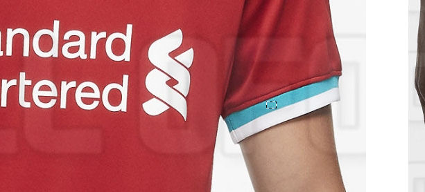
Who Replied?How in any way is that blue? Its almost exactly the same colour as the liver bird in the photo i posted and in @Woland's logo!


It looks bluer when placed in direct contrast with the red of the rest of the kit, and it was always going to.
This very debate though is proof enough that it belongs nowhere near an LFC kit. In a football context anything which even approaches blue is reminiscent of that other lot across Stanley Park. It's not a risk we need or ought to take, just for the sake of "artistic impression" or for the sake of giving the kit company's Design Dept.free rein to amuse themselves - even on purely commercial grounds, at the absolute least it dilutes the brand image.
This very debate though is proof enough that it belongs nowhere near an LFC kit. In a football context anything which even approaches blue is reminiscent of that other lot across Stanley Park. It's not a risk we need or ought to take, just for the sake of "artistic impression" or for the sake of giving the kit company's Design Dept.free rein to amuse themselves - even on purely commercial grounds, at the absolute least it dilutes the brand image.
The entire range is a load of shite.
The entire range is a load of shite.
If the tracky tops didn't have AXA on them they'd be sound
Just checking out the colour scheme of the club badge
Green? Yeah that's ok
Just checking out the colour scheme of the club badge
Looks very close to colour on the shirt trim.
Yeah, around seven percent of men are colour blind, and many don't know it
I said close, not exactly the same. Proper green trim might have been too Christmas-y, for me this is close enough to think of the badge and Liverbird and not, say, Everton.
Proper awful gear with about 2 or 3 exceptions.
Nike have absolutely shit the bed with this, give us stuff like the PSG range, loads of boss stuff.
Some of it is proper garish and gimmicky, although that will wash with loads of our fan base.
That red and white zipped trackie top is a perfect example of that.
Nike have absolutely shit the bed with this, give us stuff like the PSG range, loads of boss stuff.
Some of it is proper garish and gimmicky, although that will wash with loads of our fan base.
That red and white zipped trackie top is a perfect example of that.
Yeah, around seven percent of men are colour blind, and many don't know it
93% of the time it works everytime.
- Status
- Not open for further replies.


